Top Ten Things New Pixel Artists Should Know
Pixel art might look simple, but working with a limited canvas and tight constraints demands precision, patience, and a tasteful eye for minimalism. Whether you're creating sprites for games, icons, or just making 8-bit style art for fun, pixel art is about making every pixel count—literally. If you're new to the medium, here are ten things that can help you build a strong foundation and develop your own style without picking up a ton of bad habits along the way.
1. Keep your art at 1x when editing, but view it scaled up
You should draw and edit your art at its native 1x resolution (each square is literally one on-screen pixel), but while you’re working it’s helpful to zoom in.
When you’re ready to share it with the world, scale it up 2x, 4x, or even 32x—big enough for each pixel to feel intentional and readable, like a digital mosaic.
2. Always use 'Nearest Neighbor' when resizing
Notice how much cleaner the image on the right looks when scaled up using the Nearest Neighbor algorithm, compared to the blurry result on the left.
When scaling pixel art, use the "nearest neighbor" algorithm. It duplicates pixels cleanly, preserving their sharp edges. Other resizing methods (like bilinear or bicubic) blur the art, which destroys the pixel-perfect clarity that defines the style. Make sure to enlarge your art in 100% increments to preserve the square shape of each pixel, so if you’re canvas is 90x90 pixels, you might enlarge the final art 800% to 720x720 pixels.
3. Turn off anti-aliasing on all tools
With anti-aliasing turned on (left), selected edges are blurry. With it turned off (right), the edges stay sharp and clean.
Anti-aliasing smooths edges by blending pixels, which works great for digital painting but muddies pixel art. It creates semi-transparent or off-color pixels that can break the crisp, blocky look you're aiming for. Hand-placing anti-aliasing pixels intentionally can be a stylistic choice, and I’ll talk about how to master that in another article.
4. Sample limited palettes from 8-bit and 16-bit games
Grab screenshots from classic games and use the eyedropper tool to extract their palettes. Then challenge yourself to create something using only those colors. You’ll get a better sense of how limited palettes work and how those artists squeezed personality out of every pixel.
5. Build color ramps thoughtfully
Rather than relying on monochromatic palettes, create color ramps where lighter values shift towards warmer hues and darker values lean towards cooler tones.
Sticking to a small palette forces you to be creative and consistent. When building a color ramp, shift the hue as well as the brightness—make lighter colors slightly warmer and darker colors slightly cooler. It adds subtle depth and keeps things from looking flat or muddy.
6. Use less black for outlines
Outlines don’t need to be pitch black. Using very dark versions of nearby colors creates cohesion and reduces harshness. You can also use a lighter color on the top or lit edge of an outline to suggest a light source and add depth—without breaking the pixel art aesthetic.
7. Use layers to keep things flexible
Working with layers (for outlines, fills, highlights, etc.) makes editing much easier, especially as your piece evolves. Need to shift a character's arm or change a palette? Layers let you isolate elements instead of redrawing from scratch.
8. Avoid 'jaggies' in diagonal lines
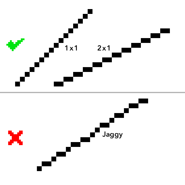
1:1 or 2:1 pixel diagonals look smoother and more intentional, while uneven jaggies can make lines appear messy or accidental.
Jaggies are uneven or awkward-looking diagonal lines that disrupt flow and form. You can avoid them by using consistent pixel groupings such as 1x1, 2x1, or 3x1 (and so on) to build smoother diagonals and curves. Clean clusters make all the difference.
9. Symmetry adds a retro vibe
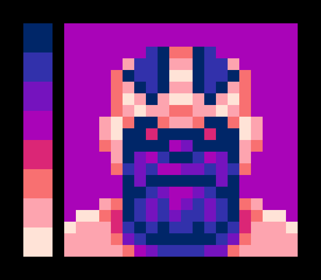
Symmetrical portraits instantly evoke the look of classic RPGs and old-school character screens. But to avoid looking sterile, throw in an eyepatch, a scar, or a crooked grin. Small asymmetries go a long way toward giving your sprite a bit of soul.
10. Avoid orphan pixels
Minimalism is at the heart of good pixel art. Every pixel should belong to a shape, shadow, or form. Orphan pixels—those one-off dots floating in space—usually look like noise or accidental specks. Clean pixel art relies on strong clusters and deliberate marks. If a pixel doesn’t serve a purpose, cut it.
Final Thoughts
Pixel art isn’t just about small canvases—it’s about making bold, readable choices with limited tools. It rewards thoughtfulness, not speed. The best way to improve is to study the work that inspires you, experiment with constraints, and stay curious. And remember: a single pixel can make the difference between “almost” and “nailed it.” Use them wisely.
Want more tips like this? Browse the Articles section for practical pixel art advice collected over 20+ years of creating work for clients like Marvel, ESPN and Disney.


