The Best Pixel Art Logos of All Time (and what I’d do to make them even better)
As a follow-up to my article The Best Pixel Art of All Time, I’ve turned my attention to the best pixel art logos that defined whole eras of gaming… and beyond. The selection spans early 8-bit titles, arcade classics, 16-bit epics, modern indies, and even a chiptune musician. To keep things fair, I set a few ground rules by which to abide.
No pre-existing IP: If the logo came before the game, an 8-bit makeover doesn’t qualify. Sorry, Ninja Turtles!
No retroactive logos: Many early arcade hits (like Pac-Man) relied on cabinet art and did not feature in-game pixel art logos until later releases. Only titles where the pixel logo was designed alongside the packaging made the cut.
Type-forward: Some games (Sonic the Hedgehog, for example) have iconic logos, but their appeal is mostly illustrative. Here, only 8-bit logos with distinctive, custom pixel art typography were considered.
With that in mind, these are (in no particular order) the ten best pixel art logos of all time (and if you’re looking to hire a pixel artist to design your next 8-bit logo click here).
Mega Man
Year: 1987
Number of colors: 5
Pixel dimensions: 182 × 56
Why it works
The pixel art logo for Mega Man doesn’t just sit on the screen, it jumps away from you. The forced perspective makes the wedge-like letterforms feel like they’re streaking upward and outward, perfectly echoing Mega Man’s trademark “teleport leap” where he blasts off so fast he becomes a blur of pixels. The horizontal color banding adds a metallic sheen, chrome without the noise that pixel art dithering can add, making the logo feel futuristic yet clean. It captures exactly what the game promised: sharp, speedy action wrapped in approachable sci-fi polish.
Design flex
Here’s the irony: this exact logo (in a smoothed, non-pixelated form) appeared only on the first box cover. Subsequent entries tried different logos for the packaging, but none matched the bold clarity of the in-game pixel art wordmark. The box art could improve, the cover illustrations could evolve, but the sprite-based title screen stayed untouched across the first six games. Capcom knew they’d nailed it on the first try, and the in-game logo became the series’ most stable and enduring brand element.
Typographic nitpick
Pixel perspective is a dangerous game, and some of the letterforms show the blocky scars. The angled strokes of the “G” and the center “A” fall victim to jaggies, with uneven steps that break rhythm. Orphan pixels poke awkwardly into the white horizontal band across “MEGA,” while the top half of “MAN” ends up drowning in too much white compared to the bottom. And the dark green shade used for the drop shadow would harmonize better with the rest of the palette if a dark blue had been chosen instead. None of these things derail the brilliance of the design, but a little more attention paid to the pixel art could have pushed it from mega-great to mega-flawless.
Very Mega! Double IPA beer can, which includes a tongue-in-cheek homage to the Mega Man logo. The angled letterforms and chrome banding nod to the original, but with more balanced shading and cleaner geometry that avoids the jaggies.
Contra
Year: 1987
Number of colors: 16 (Arcade) / 7 (NES)
Pixel dimensions: 191 × 78
Why it works
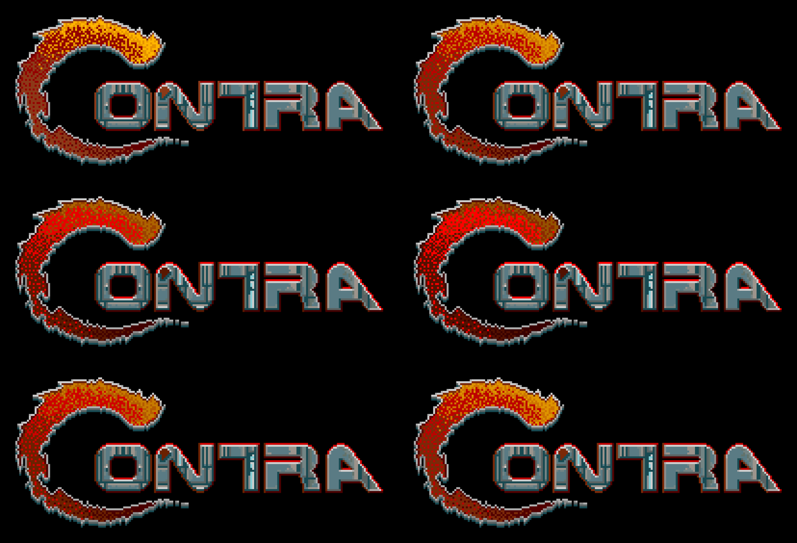
Contra’s pixel art logo is as explosive as the game itself. The enormous, fiery “C” glows with a dithered gradient that looks ripped from the game’s flamethrowers and other screen-filling pyrotechnics. It doesn’t just introduce the title, it feels like part of the arsenal. The rest of the wordmark complements the organic initial cap with sharp, angular letterforms that feel more alien than human, like they were carved from the same technology powering the enemies you’re blasting apart. For an 8-bit logo, it’s bold and aggressive… the perfect introduction to two guys blowing up an alien army in tank tops.
Design flex
That “C” went beyond ornamentation and became brand equity. It achieved instant recognition, enough that Konami could shorten the sequel title to Super C and everyone still knew what it meant. The pixel art logo’s metallic banding and exaggerated curvature give it weight and presence, a typographic power-up that overshadows even the game’s protagonists. Few logos from the era managed to distill their entire tone into a single letter this effectively.
Typographic nitpick
Look closer and the imperfections show. The diagonals of the “N” and the “A” have jaggies that look more like the work of a rushed design intern than a professional typographer. The result is a logo that is ninety percent legendary, ten percent yikes. A little more attention to detail and Contra’s 8-bit logo would have been as unbeatable as the game was (without using the Konami code of course!)
Castlevania
Year: 1986
Number of colors: 6
Pixel dimensions: 232 × 126
Why it works
The 8-bit logo for Castlevania absolutely drips gothic menace from every spooky pixel. The tall, spiky blackletter-inspired letterforms immediately set the tone: this is not just an action game, it’s a monster-hunting epic steeped in 8-bit vampire lore. The oversized “V” cleverly acts as both separator (splitting “Castle” from its hidden source word “Transylvania”) and symbol, anchoring the logo in the imagery of fangs and cruciform stakes. Even without Dracula’s castle looming in the background, the pixel art wordmark feels like a horror movie title card.
Design flex
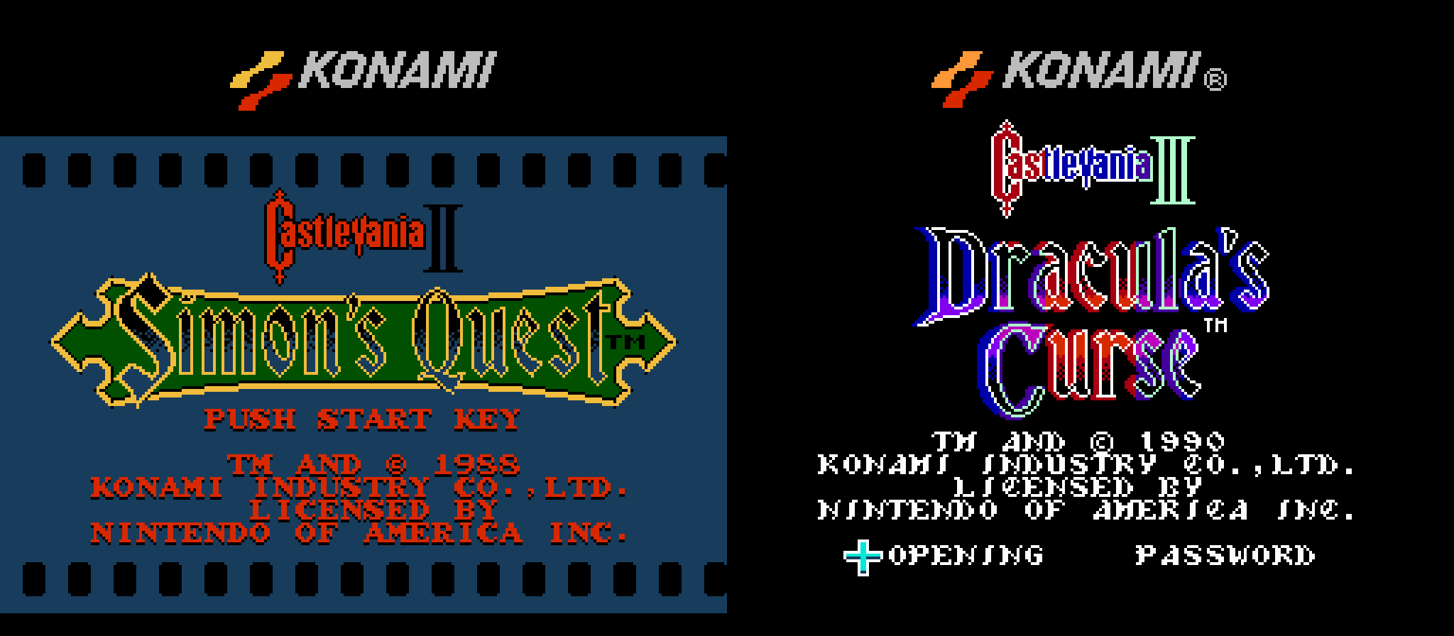
For 8-bit hardware, this was ambitious typography, full-on Gutenberg Bible energy rendered in pixel art. It is a testament to the logo’s strength that Konami could shrink it to about a third of its original size for Simon’s Quest and Dracula’s Curse, letting the new subtitles take center stage without losing brand recognition. It is one of the rare NES-era logos that balances medieval calligraphy with arcade readability.
Typographic nitpick
Not everything in this graveyard is perfectly carved. The beveled outline that frames the iconic “C” feels rushed, more jagged than intentional. The “t” casts a drop shadow that refuses to obey the rules of light. And the texture, while ambitious, ends up as more static than stonework thanks to orphan pixels and a lack of color depth.
Stardew Valley
Year: 2016
Number of colors: 18
Pixel dimensions: 228 × 104
Why it works
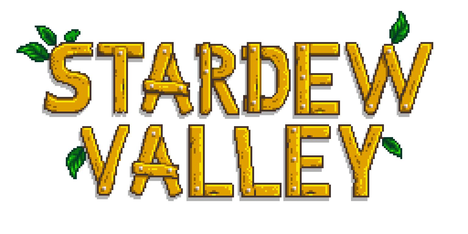
Stardew Valley’s 8-bit logo feels like it was hand-carved out of pixel wood, every plank a warm reminder of the farming life that awaits you in Pelican Town. The gold-and-brown palette suggests sunshine, straw, and soil, while the sprouting leaves woven into the letterforms reinforce the organic, living quality of the type.
Design flex
The 8-bit logo was designed by the game’s developer Eric Barone, who also created all of the pixel art sprites for the game. This shared DNA makes it feel like part of the pixel art world rather than packaging layered on top. It also shows the unique value of having a pixel artist who understands typography: the same person who built the visual world also built the wordmark, so the two feel inseparable. The result is a logo that does not just advertise the game, it grows out of it.
Typographic nitpick
The plank-and-nail treatment works great for the letterforms with straight lines, especially the T and E, but it falls apart once the curves bend like no real lumber ever could. With the leaves added, those shapes almost work as organic branches instead, but the inconsistency leaves the concept a bit... splintered.
Battletoads
Year: 1991
Number of colors: 7
Pixel dimensions: 171 × 86
Why it works
The Battletoads pixel art logo is loud, rubbery, and unapologetically grotesque, exactly what you want from a game about brawling mutant amphibians. The bulbous, warty texture of the 8-bit wordmark isn’t just surface detail, it’s a visual pun that plays directly into the characters’ names: Zitz, Rash, and Pimple. Even better, the exaggerated distortion of the letter sizes mirrors the game’s trademark gag attacks, where a toad’s fist, boot, or head suddenly balloons to absurd scale. This pixel art logo looks like it’s mid-mutation, ready to punch you off the screen.
Design flex
Few pixel art logos of the era leaned so fully into text-as-character. The swelling curves, shiny green gradients, and comic-book outlines give the whole mark an elastic energy that perfectly fits the offbeat, over-the-top tone of the game. It’s one of those rare wordmarks where the pixel art texture isn’t decorative, it’s narrative, telling you what the game feels like before you even hit “start.”
Typographic nitpick
That distortion comes at a cost. The middle letters get scrunched and uneven, making “TTLE” feel cramped compared to the sprawling outer forms. And while the palette looks like it could be a simple five-color setup, it actually uses seven. The designers tried to split the top and bottom halves of the letters to create a metallic sheen: the yellow-to-orange transition sells the effect, but the two green tones are so close in value that the split barely reads. The result is a pixel art logo that succeeds as a cartoon mutation, but stumbles a bit in rhythm and polish.
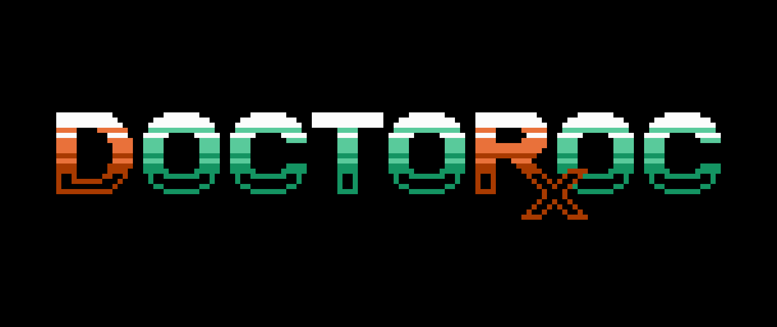
Doctor Octoroc
Year: 2008
Number of colors: 6
Pixel dimensions: 130 × 21
Why it works
This is the only pixel art logo on the list not made for a video game, but for a chiptune musician who composes with Game Boy hardware. That makes it a more modern entry, though one steeped in NES-era aesthetics. The layered gradient bands mimic CRT scanlines while giving each glyph a satisfying, tactile weight. Even better, the rhythmic repetition of “Doctor Octoroc” is echoed visually in the uniformity of the 8-bit letterforms, a rare case where a logo’s audible cadence syncs perfectly with its visual rhythm (an especially fitting trait for a musician’s mark).
Design flex
The color treatment does double duty. By highlighting the “D” and “R” in a different palette, the viewer’s eye bounces back and forth: first reading “Doctor” from the DR, then continuing naturally into “Octoroc.” It saves valuable pixel space by letting the two words overlap while still reading clearly. Bonus points for the “R” and “x” fusing into a medical prescription symbol, a clever pun that sells the theme and reinforces the alias in one stroke. You can see more 8-bit typography from this pixel artist here.
Typographic nitpick
The biggest risk of all this cleverness is that to a casual observer, the overlap might just read “DOCTOROC.” It is a logo that rewards familiarity more than instant clarity. For a musician, that is not necessarily a flaw, since true fans will recognize and appreciate the hidden tricks, while newcomers only need to hear the name once before the puzzle clicks into place. That being said, the logo was still esteemed enough to be featured in Print Magazine’s Regional Design Annual (2009).
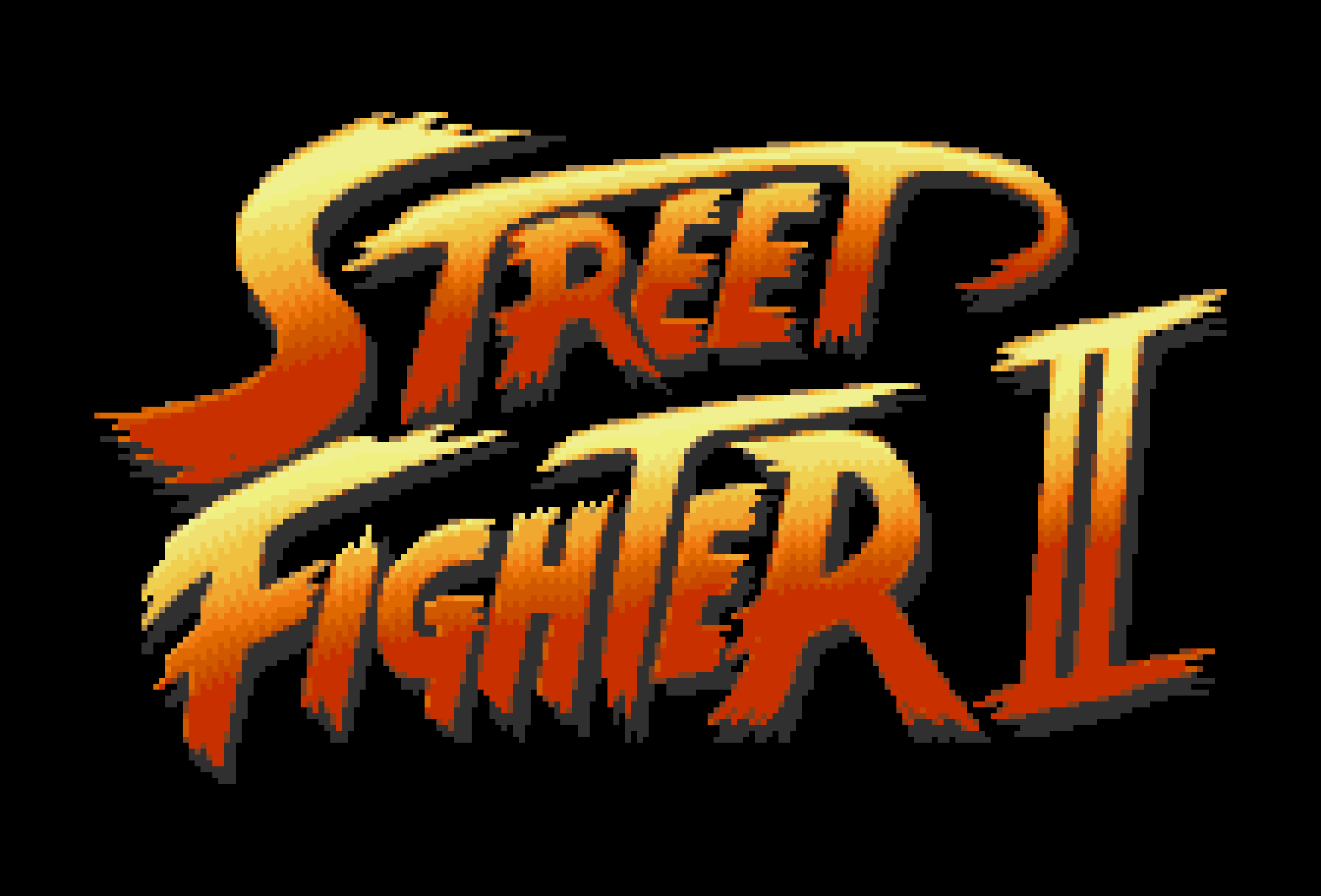
Street Fighter II
Year: 1991
Number of colors: 15
Pixel dimensions: 192 × 114
Why it works
Street Fighter II’s pixel art logo is a typographic punch to the face. The jagged, slanted letterforms scream speed and impact, perfectly mirroring the game’s arcade brawls. The flaming gradient, from bright yellow to deep red, adds heat and aggression, making the pixel art wordmark feel like it is mid-hadouken. Even the italicized tilt gives the sense of motion blur, as if the title itself is lunging across the screen to land a hurricane kick.
Design flex
Where many arcade logos of the era went for blocky boldness, Capcom doubled down on spectacle. The brush-like strokes suggest graffiti or calligraphy done with fists instead of pens, giving the logo a raw street energy that matched the urban backdrops. The oversized, glowing “II” created a clear hierarchy and reinforced the sequel’s identity, signaling a new era in arcade fighting games.
Typographic nitpick
One of the ironies of pixel art logo design is that sometimes a larger palette can hurt more than it helps. With 15 colors in play, Street Fighter II’s logo loses some of the crisp pixel definition that makes this medium shine. The gradients blur into each other, softening edges until it’s hard to tell where one shade ends and the next begins. That smoothness undercuts the raw punch of the wordmark, making it feel more airbrushed than pixel-forged. Above, I rebuilt the pixel art logo with only 7 colors and, as you can see, the harder edges instantly gave it a fiercer presence.
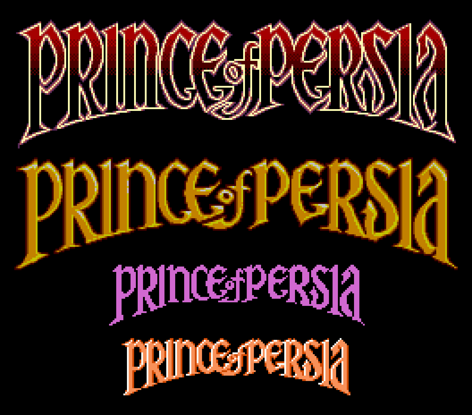
Prince of Persia
Year: 1992, 1994
Number of colors: 5 (Sega Genesis, shown) / 7 (Super Nintendo) / 5 (Sega Master System) / 1 (Game Boy Color) / 3 (NES)
Pixel dimensions: 261 × 63 (Sega Genesis, shown) / 246 × 72 (Super Nintendo) / 248 × 63 (Sega Master System) / 143 × 34 (Game Boy Color) / 128 × 32 (NES)
Why it works
Prince of Persia’s logo is an elegant piece of pixel art typography, tall and regal without slipping into cliché. Where many games of the era leaned on lazy “exotic” tropes, this design captures the grandeur of its setting through sheer grace of letterform. The tapering verticals and subtle curves feel both architectural and calligraphic, as if the letters were carved into stone and then draped with silk. It is sophisticated, restrained, and timeless, setting the stage for a game that was just as much about fluid motion as it was about swordplay.
Design flex
This is a masterpiece of 8-bit typography, built for versatility. On Genesis, the warm gold gradient and delicate shading give it dimensional weight, but the same letterforms hold up beautifully across platforms. On the Super Nintendo, the gradient flips to a crimson sunset with a thin, gilded outline enveloping each character. Even on the Game Boy, stripped to a single color, the pixel art type remains instantly recognizable, a testament to how strong the underlying letterforms are.
From top to bottom, the variations on the Prince of Persia logo for: Super Nintendo, Sega Master System, Gameboy Color, and the Nintendo Entertainment System (NES).
Typographic nitpick
The Genesis version is nearly flawless, but the “o” is a little thick. On the SNES, the outline tries to add drama but clumps in spots, creating more contrast than the delicate forms beneath can comfortably carry. These are minor stumbles, more technical than conceptual, and overall this is one of the best pixel art logos to ever grace a game’s title screen.
Bubble Bobble
Year: 1988
Number of colors: 4
Pixel dimensions: 143 × 112
Why it works
The rounded, inflated letterforms of Bubble Bobble’s 8-bit logo capture the same weightless whimsy as the bubbles spit across the screen by the game’s wide-eyed pixel protagonists. The clustered bubble backdrop makes the title feel as if it is rising upward, echoing the gentle lift of the game’s drifting orbs. And while the pixel art logo works perfectly as a static image, the in-game touch of animated bubbles rising up around it adds a layer of charm that makes the title screen feel alive.
Design flex
Instead of defaulting to angular arcade conventions, Taito leaned into effervescence. The uneven rhythm of the circular forms make the logo feel seamlessly tied to the bubble-soaked action. Despite its playful irregularity, the pixel art wordmark stays clear and legible, while the rising bubbles on the title screen amplify its charm. It is deceptively smart: lighthearted in style yet consistent in readability.
Typographic nitpick
The cloud outline is not always as smooth as it could be. Some of the bubble shapes flatten into awkward ovals, and clusters of black pixels collide in ways that look clumpy rather than airy. The unevenness keeps it from reaching the satisfying perfection of real bubbles. Still, the flaws are forgivable in a pixel art logo whose very mission is to be playful. Even lopsided, it stays irresistibly fun.
Breath of Fire
Year: 1994
Number of colors: 25
Pixel dimensions: 202 × 104
Why it works
Breath of Fire’s pixel art logo draws its strength from the same source as its protagonist, Ryu, whose defining power is the ability to transform into a dragon and… breathe fire. The 16-bit letterforms curl upward with jagged energy, and the blazing hot gradient makes them feel alive, words literally written in flame. It is dramatic without being overdone, a design that sets the tone for a story built on transformation and elemental power.
Design flex
In the original Japanese version, the dragon exhales a fiery plume of pixels across the top of the logo, framing the kanji symbols for the words “Dragon Warrior”. For the North American release, Capcom stripped away this subtitle, producing a stronger, cleaner mark. The sweeping negative space still suggests the “breath of fire,” but in a subtler, more elegant way. It is a rare case where localization improved the design, creating a logo that says more with less.
Typographic nitpick
The flames themselves are spot on, no notes. The real issues lie in the supporting details. The black outline breaks up too much in the lower half, while the upper half is too heavy. It competes with the fire instead of letting it sizzle. Similar to the Prince of Persia logo, the “of” in the middle feels half-baked. But the biggest problem is the purple chosen for the 3D extruded block effect, which clashes against the fiery tones. A cooler, more muted shade would have made the flames blaze brighter and pushed this already strong wordmark into pixel art perfection.
The Paradox of Pixel Art Logos
Pixel art logos were drawn small but had to act big. Hardware limits forced them into tight grids and limited palettes, but they were expected to roar onto the screen with the magnificence of a Hollywood blockbuster. Players didn’t see the constraints though, just the spectacle of fiery gradients, gothic spires, or bubble-soaked chaos. These 8-bit typographic wonders weren’t just dots on a screen… they were the promise of an unforgettable adventure.


